

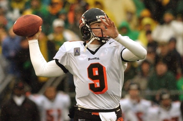
In 2013, coincidentally when I was still working as a student manager for Oregon State Football, Nike decided to rebrand Oregon State athletics.
The new Beaver logo and font just modernized the old logo, and with that came more modern uniforms and jerseys for most sports. However, Nike and the other people who assisted Nike with the design of the football uniforms absolutely ruined them. They’re too messy, and the small details don’t really make sense. I’ll get into that a little more below.
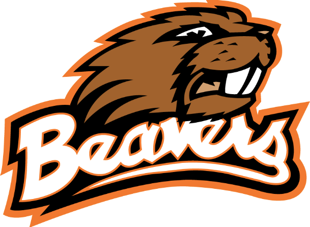
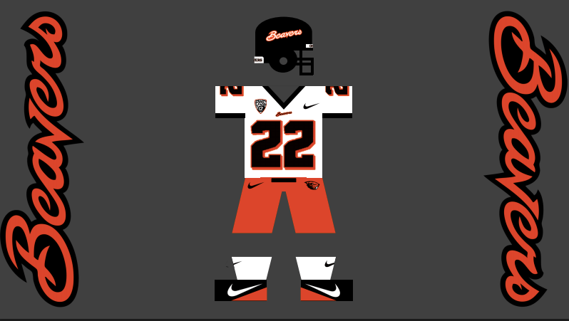
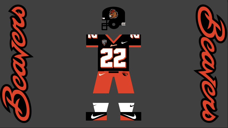
Here’s the old logo (top), new logo (middle), and new football uniforms (bottom):

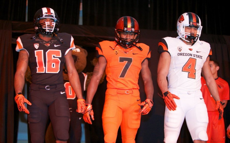
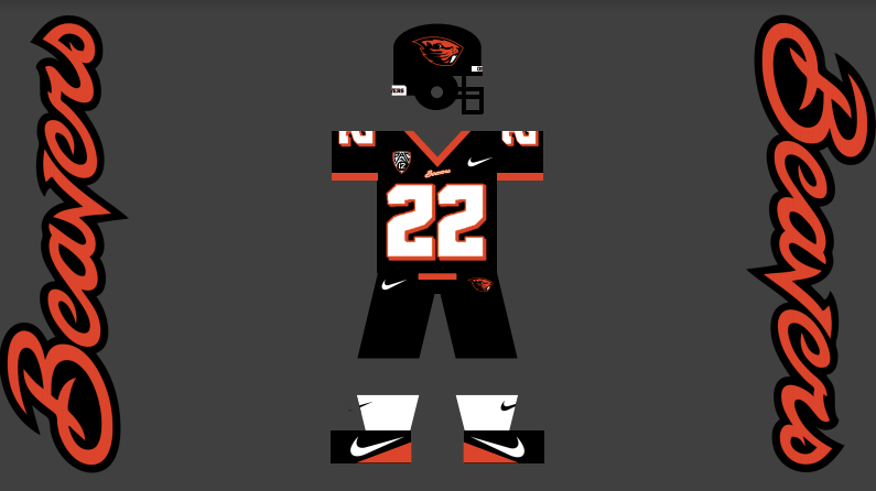
As you can see above, you cannot mix and match the different uniforms and helmets without it looking stupid, because the stripes aren’t consistent. The black and white uniforms, helmets, and pants, all have all three main colors. Black, orange, and white, all in a consistent fashion so they could be worn together.
But for some reason, Nike decided to make the orange uniforms, helmets, and pants only orange and black, no white included like the other uniforms.
The orange uniforms actually include BRONZE accents. WTF? There is historical significance that I don’t need to get into, but it made no sense whatsoever when they did it, considering the other two uniforms.
Doing that created inconsistency, which drives people like me insane, and makes it obvious to the casual fan that the uniforms look weird when mixed and matched because of those inconsistencies in colors and stripes.
NOTE: They have recently abandoned the black helmet above and use an all black helmet with a single orange stripe, creating EVEN MORE inconsistencies. Also, a few seasons ago they abandoned the face mask stripes and used solid colored face masks.
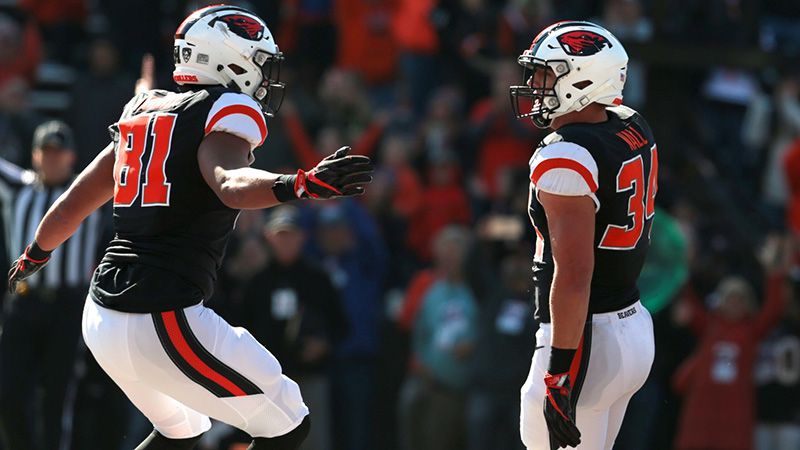
Of course, there are a few combos that work (see below), but anything mixed with orange looks odd.
Now, for my ideas.
In my opinion, this is the best Oregon State Football uniform of all-time:
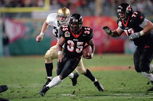
It’s simple. It includes the school colors. And the uniforms can be worn with every other uniform/pant/helmet because the schemes/stripes/designs are consistent.
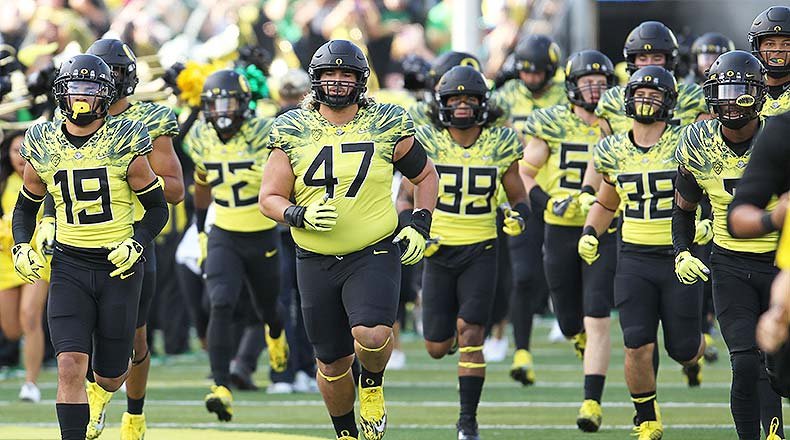
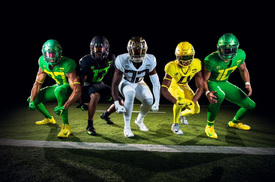
Now, as a Beaver, we all know how much I hate the University of Oregon, but I have to give them props on their new uniforms. Other than the comically large numbers that I would do without, they are simple, they are sleek, and they can be worn in any combination.
Here’s an example of one of their older, more insane and busy uniforms (top), and their new ones that I actually like (bottom):
Back to my ideas.
Oregon State should follow the lead of the schools with uniforms that can be mixed and matched, and all combinations make sense (Oregon, Washington State, Boise State, West Virginia, etc.).
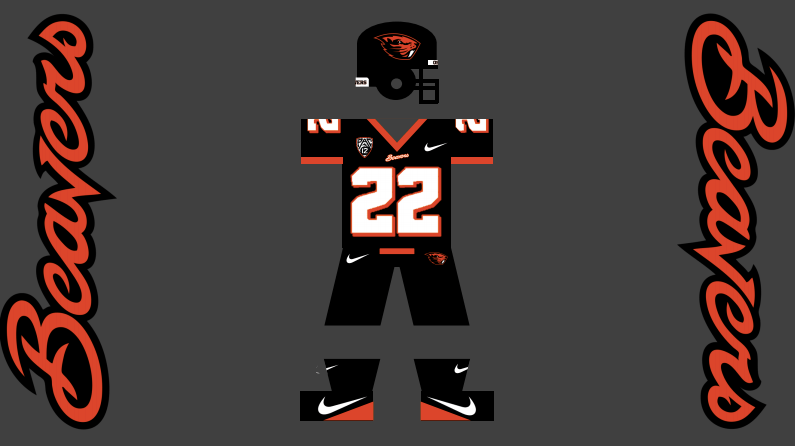
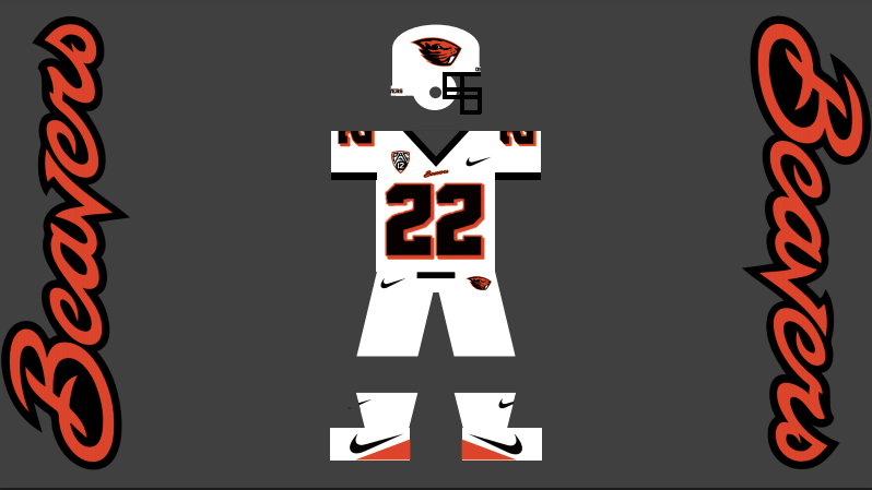
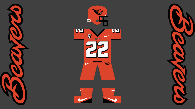
Oregon State should also pay tribute to the 2001 Fiesta Bowl team that was lead by new head coach Jonathan Smith. While honoring that Fiesta Bowl team, they could modernize it as well. Add a white and and orange helmet to the classic all black one, and make a version of the same uniform and pants in all three school colors.
The basic uniforms would look like this, with the old school numbers on the updated uniforms:
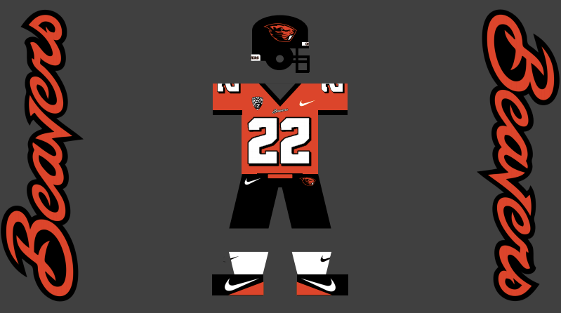
Those were just the simple looks that would please purists. They could also mix it up and create some really fun combinations that the fans would love.
Some interesting uniform combos, including different helmet logos, could look like this (obviously socks could be whatever color you want given the week):

The uniform designs above address all of my issues with the current Oregon State Football uniforms. They are simple. They have continuity of colors on each uniform for mixing and matching that makes sense and looks good. And finally, while simple, they are still very unique given Oregon State’s interesting color combination that only a few schools share.
If you agree with most of my ideas, but want an even more modern look, something similar to what the Ducks and a few other schools that have adopted the simple look have, Nike could do something like this for the Beavs:


This look is even more streamlined and simple, but somehow more modern and sleek.
If you like simple uniforms like I do (Stanford, Penn State, Alabama, Texas), then these may be the ones that you like better. They could also be used in any combination, and it would look good.
Uniforms designed by Kyle Hamlin and Thomas Lovejoy, and Kyle did all of the dirty work creating them on his computer. He’s a psycho detail freak.
If you like them, retweet this blog! If you hate them or have a better idea, reach out to me on twitter @thomaslovejoy or @TheBench__
#GoBeavs

I also think the duck uniforms look ok … EXCEPT THE BLACK ONE!
LikeLike